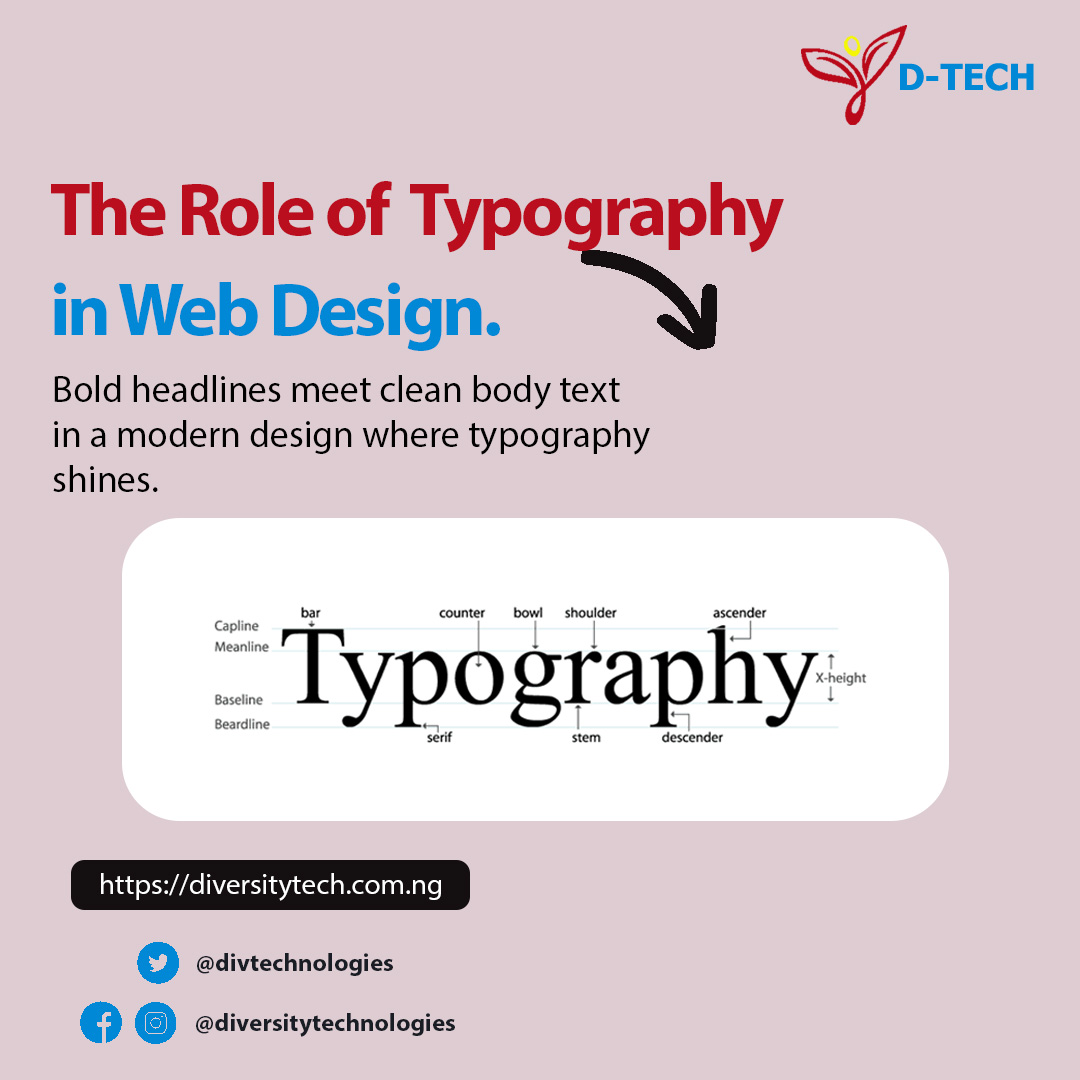
At first glance, typography might seem like a simple aesthetic choice—just picking a nice-looking font. But for any digital agency focused on results, it’s so much more. Typography is a powerful workhorse of web design, silently guiding users, shaping perceptions, and driving actions.
At Diversity Technologies, we don’t just design websites; we craft digital experiences. And a foundational element of that experience is strategic typography. It’s the voice of your brand in a visual form. Let’s break down why typography is critical to your website’s success.
Why Typography is a Pillar of Effective Web Design
Typography comprises everything from font selection and size to line spacing (leading), letter spacing (tracking), and color. When harmonized correctly, these elements achieve four key objectives:
1. It Creates a Powerful First Impression & Builds Brand Identity
Your typeface choice speaks volumes about your brand before a user even reads a word.
- Serif fonts (e.g., Merriweather, Playfair Display) often convey tradition, trust, and authority. Think of established news outlets or financial institutions.
- Sans-serif fonts (e.g., Open Sans, Inter, Lato) feel modern, clean, and approachable. They are the go-to for tech companies and minimalist brands.
- Display fonts are unique and impactful, perfect for memorable logos or short, bold headlines.
The consistent use of a typographic system across your site reinforces your brand identity and makes it instantly recognizable.
2. It Drives Readability and User Experience (UX)
A website’s primary job is to communicate. If your text is difficult to read, users will leave. Good typography reduces cognitive load and makes consuming your content effortless.
- Hierarchy: Using different font sizes, weights (bold, light), and styles guides the user’s eye through the content. A clear hierarchy (H1 > H2 > H3 > Body Text) helps users scan for information quickly and find what they need.
- Spacing: Ample line height and paragraph spacing prevent text from feeling cramped and overwhelming. Proper line length (ideally 50-75 characters per line) ensures the eye can comfortably move from one line to the next.
3. It Influences User Emotion and Tone
Typography has a subconscious psychological impact. A fun, quirky script font sets a completely different tone than a strong, geometric sans-serif. The right typographic choice ensures the feeling of your website matches your message—whether it’s professional, playful, luxurious, or innovative.
4. It Boosts Conversion Rates and Engagement
Strategic typography is a silent conversion expert.
- A clear, compelling Call-to-Action (CTA) button with bold, commanding text is more likely to be clicked.
- Well-formatted, scan-able content keeps users on the page longer, increasing the chance they’ll take a desired action.
- Legible form labels and input text reduce friction and increase completion rates.
Best Practices for Web Typography (Our Expert Guide)
Implementing typography effectively requires more than just good taste. Here are our core principles at Diversity Technologies:
- Limit Your Font Palette: Stick to 2-3 fonts maximum. A common and effective combination is a expressive font for headlines and a highly readable font for body text. Too many fonts create visual chaos.
- Prioritize Readability Above All:
- Size Matters: Body text should generally be at least 16px. This is a web accessibility standard and improves readability on all devices.
- Contrast is Key: Ensure there is sufficient contrast between your text color and the background. Low contrast is a major accessibility barrier. (Tools like WebAIM’s Contrast Checker are invaluable).
- Establish a Clear Hierarchy: Use HTML heading tags (H1, H2, H3) properly. Your H1 should be the largest and most prominent, with each subsequent heading level sized proportionally smaller. This is also crucial for SEO.
- Choose Web-Safe & Web-Fonts: Use reliable web fonts from services like Google Fonts or Adobe Fonts. These fonts are optimized to load quickly and display consistently across different browsers and devices.
- Mind the Mobile Experience: Typography must be responsive. Font sizes, line heights, and margins often need to adjust on smaller screens to maintain readability and hierarchy. Test thoroughly!
How Diversity Technologies Weaves Typography into Our Process
For us, typography isn’t an afterthought. It’s integrated into our design and development strategy from day one.
- Discovery: We start by understanding your brand’s core personality, target audience, and communication goals.
- Strategic Selection: We curate a shortlist of typefaces that align with your brand identity and functional needs (e.g., language support, load performance).
- System Creation: We build a full typographic scale—a set of rules defining styles for every text element on your site, from headlines and quotes to captions and buttons. This ensures consistency and speed in development.
- Performance Optimization: We implement fonts efficiently (using
preloadand modern file formats likewoff2) to ensure they don’t slow down your site—a key factor for SEO and user retention.
Ready to Harness the Power of Typography?
Your website’s text is more than just information; it’s an experience. Investing in professional, strategic typography is investing in better user engagement, stronger brand loyalty, and higher conversion rates.
Does your website’s typography speak the right language? Let the experts at Diversity Technologies audit your current design or craft a new, typographically-driven experience from the ground up.
Contact Us Today for a free consultation and let’s build a website that not only looks great but performs brilliantly.
